BRANDING, IDENTITY, WEBSITE, MEDIA SUPPORT

Hear the smile
in our voice

Call Center Branding with
photo and video support
From Naming to Packaging Design for premium cosmetics based on Brazilian Wax


BRANDING, IDENTITY, WEBSITE

Workforce Provider
positioning as a brand

Building a HR company brand
based on HR origins
Building a HR company brand
based on HR origins

How to hear a
smile in a voice
Define the Brand’s Position,
Craft the Brand Story, Develop Tagline,
Design Logo & Graphic Elements,
Create Branding Manual, Develop Website,
Shoot and edit Video Presentations
Define the Brand’s Position, Craft the Brand Story, Develop Tagline, Design Logo & Graphic Elements, Create Branding Manual, Develop Website, Shoot and edit Video Presentations

Brand Story

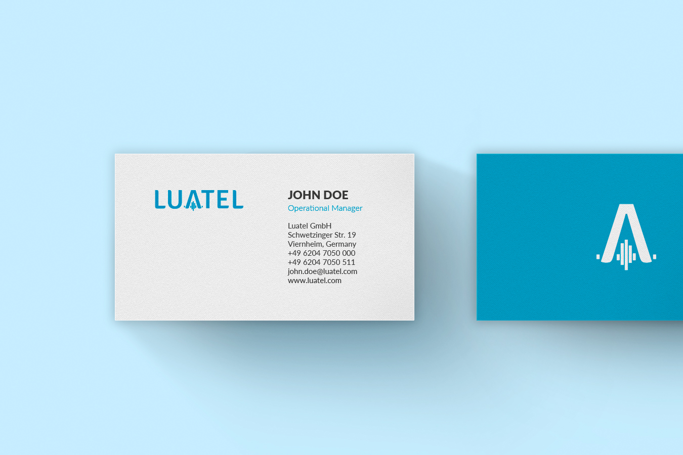
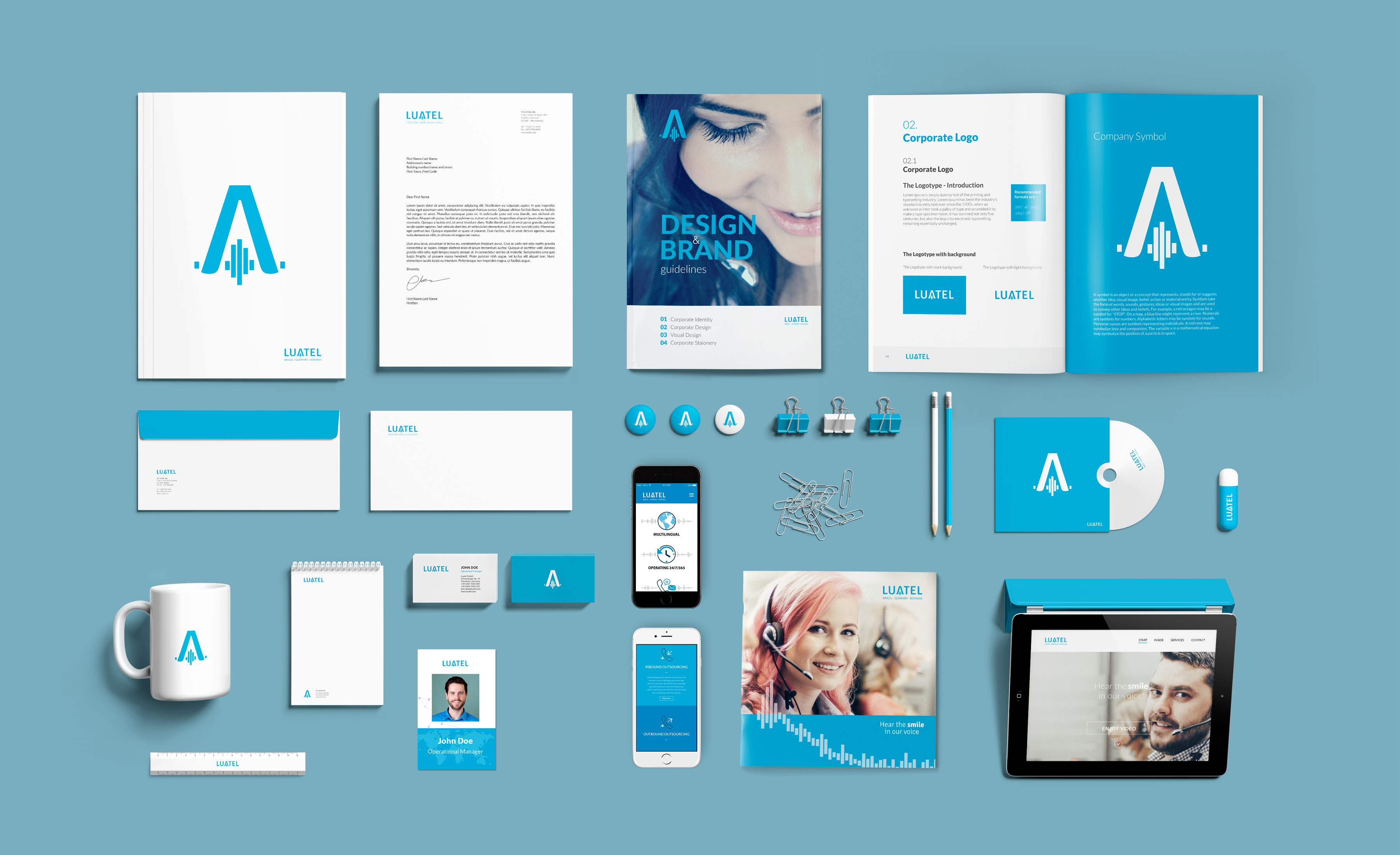
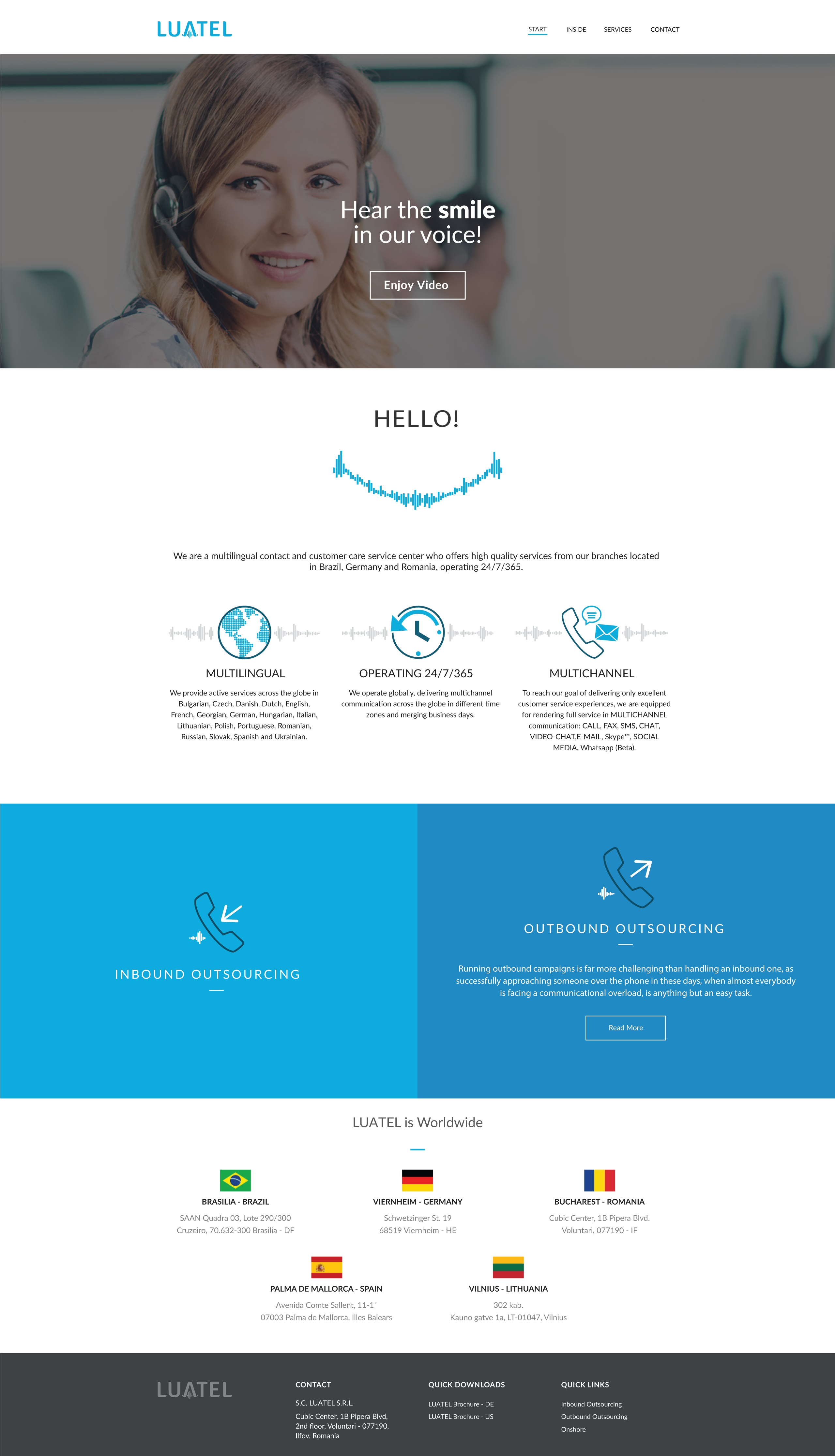
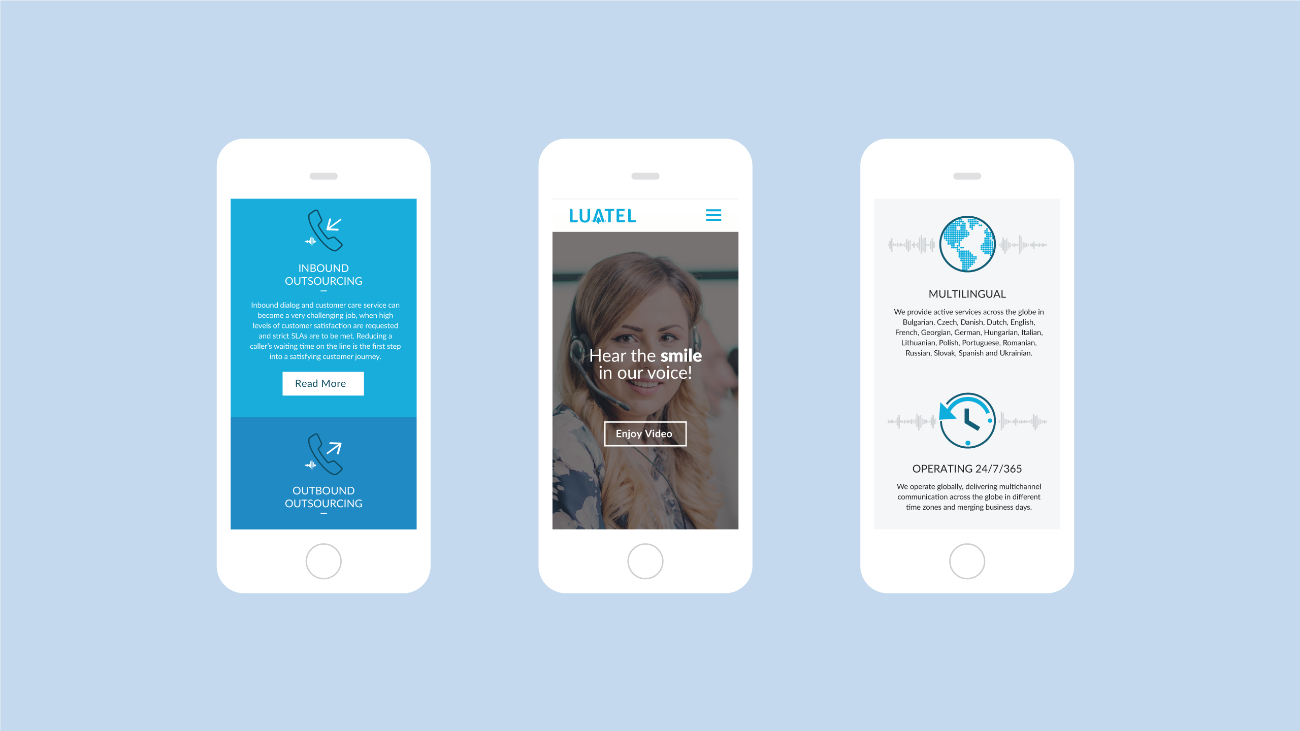
LUATEL is a multilingual contact and customer care service center which offers high quality services from its branches located in Brazil, Spain, Germany and Romania, operating 24/7/365.

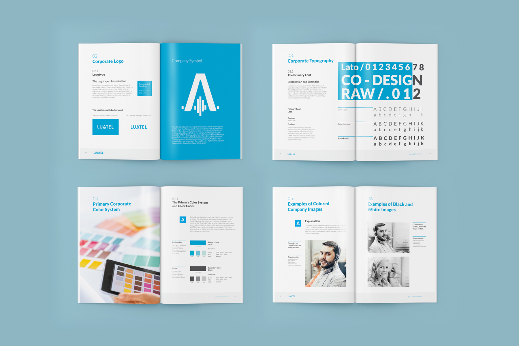
Given the growth of the company over 10 years and its expansion to 5 countries, the need for a solid corporate branding was obvious.

Logo Design Brand Mark of Luatel

Brand Strategy

Baseline Evaluation,
Research, Branding Strategy
Baseline Evaluation, Research, Branding Strategy

A Call Center business is about voice communication, but how to make it special, innovative and professional at the same time?

You can really tell if a person smiles during a phone conversation. This was the main asset. We came up with the representative tagline “Hear the smile in our voice” as the emotional testimonial.

Logo Design Branding Luatel

Logo Design &
Identity

Naming, Logotype,
Iconography, Lettering,
Collaterals, Colors
Naming, Logotype, Iconography, Lettering, Collaterals, Colors

For a Call Center corporation, the logo needed to be clean, simple, recognizable, intuitive and with a technical reference. We chose to use a custom font for the main logo writing, with personalized lettering that can also go as a symbol. We took the mid letter A and blended it with a voice wave symbol. This is how we obtained a lettering logo for LUATEL and the “A” symbol to be used for minimal branding communication.

Our graphic design team used a custom set of medium light icons and corporate blue to make them part of the brand. All the collaterals, from business cards to brochures, are linked by the main light blue color, the logo, symbol and sans sheriff lettering for the technical aspect. The custom icons fit on detailed brochures, as well as for the website content.

Brand Tagline Luatel
Brand Visual Communication Luatel
Logo Brand Mark Luatel
Visual Identity Business Card Luatel
Branding Icons Design Luatel
Visual Identity Collaterals Luatel

Brand Manual

We created the brand manual to explain the rules of the LUATEL brand in terms of graphic design and usability of the brand so that all brand communication can be easy to follow, regardless of country or language. A brand manual allows for a high brand consistency and prevents brand alteration whenever outside people are involved, such as partners, collaborators or advertising agencies.

Brand Book Luatel
Brand Guidelines Luatel

Photo Shooting

Brief, Composition & Lights,
Shooting, Photo Editing,
Color Correction

To drive the rebranding process, a professional photographer was assigned to this project and guided by our team, so that all the brief requirements were completed.

We took care of all the aspects involved, from script to post-processing, providing the brand with the look and feel of a professional Call Center based on human contact.

Brand in Motion

Script, Video shooting,
Image processing,
Soundtrack implementation,
Video editing
Script, Video shooting, Image processing, Soundtrack implementation, Video editing

For the new brand, we suggested showing it in motion for a quick and meaningful impact and thus shot a 2-minute video of the Call Center activity.

Our creative department supervised the video shooting team, and took care of the casting, infographic design, custom icons and post-process image and sound. We delivered a stunning long version (2 min) and a teasing short version (15 sec) of the video presentation.

The Website

Fully Responsive,
Friendly content management system,
Admin account,
User account
Fully Responsive, Friendly content management system, Admin account, User account

WEB DESIGN

Based on the blue color and custom icons, along with stunning photos, all the aspects of the Call Center were highlighted in a user-friendly structure. In keeping with the B2B communication, we opted for a service-based structure and created a high rate of conversion from visitors to offer requests.

WEB DEVELOPMENT

The website was built on a high-quality and highly customizable WordPress theme. We made sure to use standard coding, such as clean & valid CSS, error-free PHP and valid HTML and have Cross Browser and Full Responsive ability. The visibility of the website is achieved by using Meta tags and SEO-friendly coding.

Web Design Luatel
Responsive Design Call Centre Luatel