BRANDING, UI / UX, WEBSITE

Branding for an eloquent
copywriting agency

Naming, Branding and Website for a
copywriting company focused on eloquent content.
Naming, Branding and Website for a copywriting company focused on eloquent content .

How to translate
copy into visual
Define the Brand’s Position,
Craft the Brand Story, Develop Name,
Design Logo & Graphic Elements,
Web Design.
Define the Brand’s Position, Craft the Brand Story, Develop Name, Design Logo & Graphic Elements, Web Design.

Brand Story

The team behind Eloquentia consists of native speakers for each target language offered in the portfolio, who have worked together in the translation and editing business for several years.

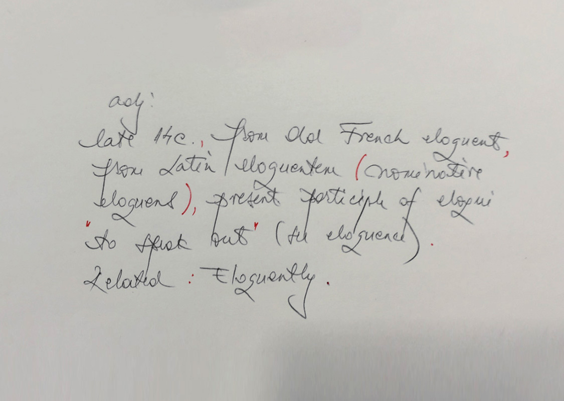
Throughout our partnership with them, we found out that everything they have done turned out to be very eloquent, no matter what language was the source or target. Because of this, the naming process was very natural and “Eloquentia” stood out as representative of what they do.

Brand Strategy

Baseline Evaluation,
Research, Branding Strategy

Eloquentia as a brand needed to communicate to its audience – through logo, visual identity and graphic design – their expert level of grammar and  their high quality standards ensured by native speakers.

We concluded that an educational tone of voice would bring trust and professionalism to people’s minds, especially when talking about foreign speakers.

Logo Design

Naming, Logotype,
Lettering, Colors

In terms of eloquent translations, interpreting or copywriting, punctuation has a major role, from the meaning to the right interpretation. We crafted the logo symbol using negative space, symbolizing the comma and inverted comma. The color red was chosen for its symbolic correction in the education system. The Sheriff classic font was the perfect match to complete the logo.

Visual Identity

For a complete visual identity, we created a group of custom icons based on punctuation and letters. All icons will feature repetitively on every collateral material to sustain the brand. They can be employed as a group, or individually when a specific service is described.

Classic sheriff lettering polishes off the visual identity and gives it an academic approach.

Key Visuals

The Eloquentia brand needed to connect with people and make them see it, feel it and interact with it. To start this brand awareness, we developed a print campaign based on key visual posters.

Two types of posters were made, one based on custom icons representing the services available for each language, with its specific country colours, and a general one, with the Tower of Babel as the main theme for multilingual communication.

Website

Web Development,
Fully Responsive

The website concept ensures brand continuity, by respecting the graphic design style combined with user-friendly navigation and intuitive structure. Once the visitor lands on the homepage, the “call to action” is a natural process, which helps to convert visitors into customers.

The website was built on a high-quality and highly customizable WordPress theme. We used the standard coding, clean & valid CSS, error-free PHP and valid HTML and have Cross Browser and Full Responsive ability. The visibility of the website is achieved by using Meta tags and SEO-friendly coding.

branding services