BRANDING, IDENTITY, UI/UX DESIGN

The journey of a brand
with digital support

Creating a visual identity and
digital support for a trike club
Creating a visual identity and
digital support for a trike club

Define the Brand’s Position
Craft the Brand Story
Develop Names
Design Logo & Graphic Elements
Web Design

Brand Story

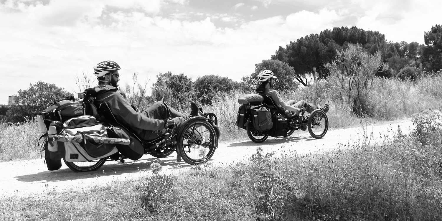
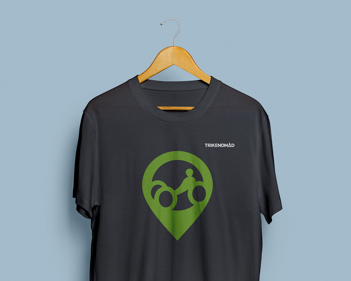
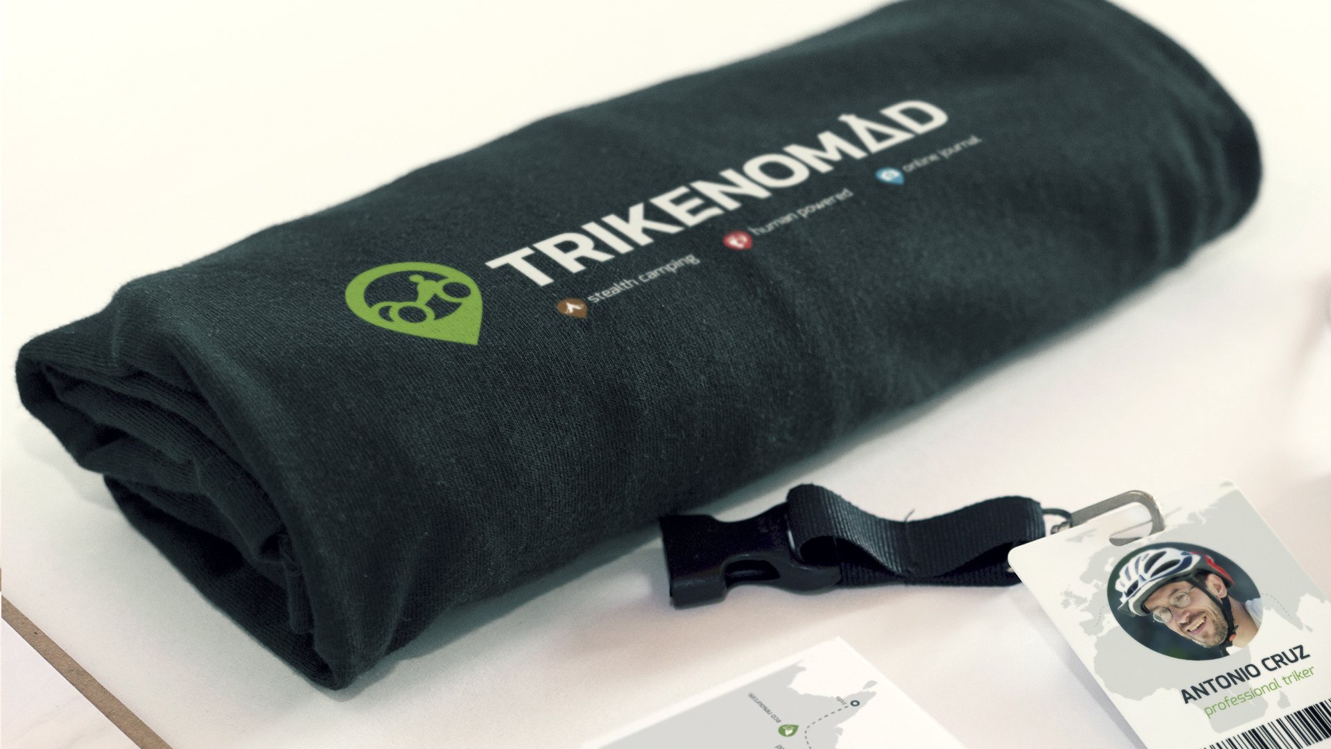
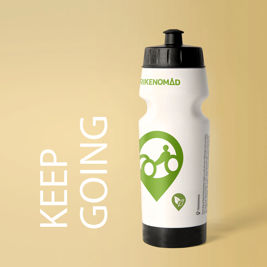
When you want to explore the world, you’d better do it on a trike. We know that from a trike club who approached us for branding.

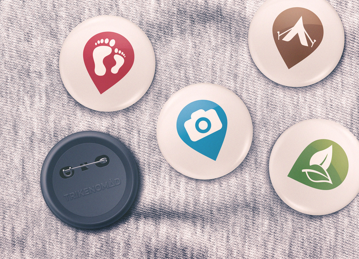
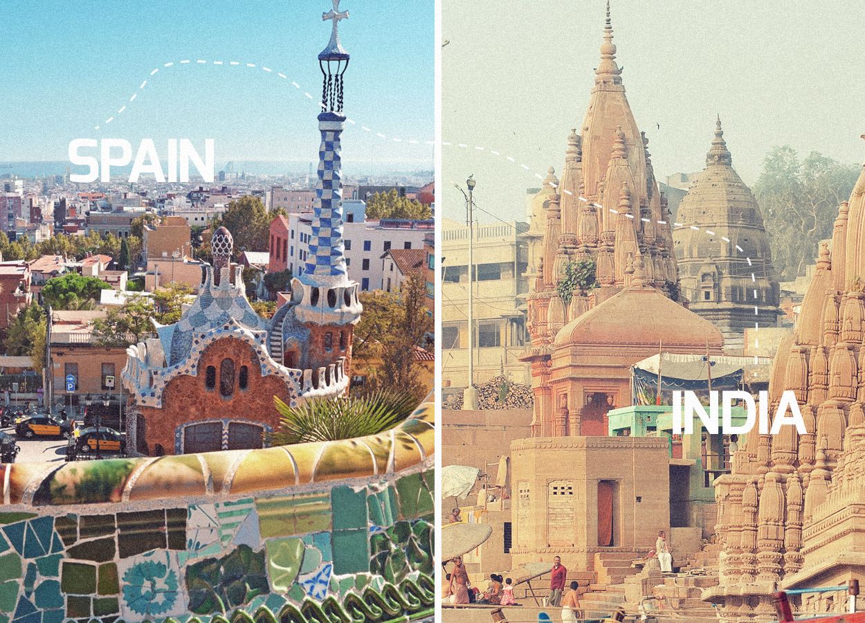
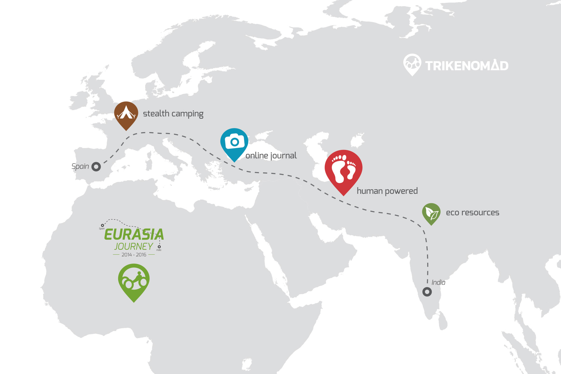
The club was initially founded just for weekend tours near Madrid, but soon, the desire to explore the world grew fast. More people joined the club and training sessions got intense. After 2 years of triking around Spain, two of the members decided to go on a major trip from Spain to India with support from the club. The journey concept was based on human-powered transportation (trikes), self-sustained touring and eco lifestyle (from food to camping and hygiene)

Brand Strategy

We identified a shortlist of key words relevant to the club: trike, travel, outdoor, camping, nature, explorer. The naming process stopped at “trikenomad”. We named the journey as explicitly as possible – EURASIA.

We blended TRIKENOMAD and EURASIA into the visual representation: logo, brand identity, and web design.

To build brand awareness we came up with materials like the bottle design, branded t-shirts, printed posters, flyers and business cards.

Logo Design

We crafted a logo inspired by a map pointer, with the shape of a triker blended inside and we used discrete but strong lettering for TRIKENOMAD. The letter “A” was modified to suggest a camping tent.

Because they are supporting a life experience which involves pollution-free traveling through nature, we chose natural green as our base color.

Packaging

Design

Because they only use fresh water from natural sources, the bottle is an essential accessory for every triker. We communicated the TRIKENOMAD brand with an eco-attribute, as indicated by the leaf custom icon carefully placed next to the logo symbol.

The Journey

BRAND STRATEGY

A specific logo was created for the EURASIA Journey, representing the path from Spain to India.
To advertise the Journey, we designed the map showing the route from Spain to India. Our graphic design team produced posters and flyers making reference to detailed aspects of the journey. The idea was to share this amazing journey via an Online Journal.

CUSTOM ICONS

To communicate all the attributes of the brand through graphic design, we crafted a custom-made set of icons. Human-Powered, Online Journal, Stealth Camping, Eco Resources. All the symbols are fitted into a map indicator shape to make the traveling connection.
Using these icons, we designed badge pins for fans and followers.