BRANDING, PACKAGING DESIGN

Hi-Branding
for Hi-Tech

From Naming to Packaging Design for telecom equipment retailer.

How to visually
communicate for
a telecom retailer.
Define the Brand’s Position, Craft the
Brand Story, Develop Name,
Design Logo & Graphic Elements,
Design Packaging

Brand Story

Two guys were passionate about high-tech communication. They both had a telecom background and together started a retail business of telecom equipment. Based on telecom engineering knowledge and custom support, the business grew fast and professional branding was needed.

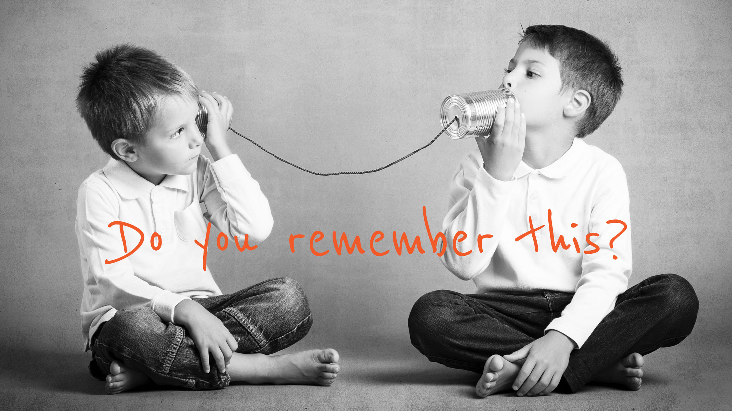
While briefing with the COMSTORE guys, a small detail stood out from the conversation. As kids, they used to play with phone cans. In fact we remembered that some of us did this too, we exchanged memories related to that kind of game, what materials we used and how much fun it was.

Together we established the branding goals: showing high-tech products offered by experienced people, with reference to technical solutions, custom support and professional feel.

Brand Strategy

Baseline Evaluation,
Research, Branding Strategy

After defining the brand’s position on the market – as an experienced telecom adviser and provider for small and medium-sized businesses – the branding strategy was based on their passion for telecom and the know-how offered by people who wanted to communicate since they were kids. The naming was very appropriate and after our proposal of the tagline, it turned out to be perfect:

COMSTORE

Best Tech to Buy

Logo Design &
Identity

Naming, Logotype,
Iconography, Lettering,
Collaterals, Colors

The brand creation process started with the drawings of the phone cans, followed by the shapes and branding elements. After very detailed fine tuning, the logo came out as clear and intuitive for the target market.


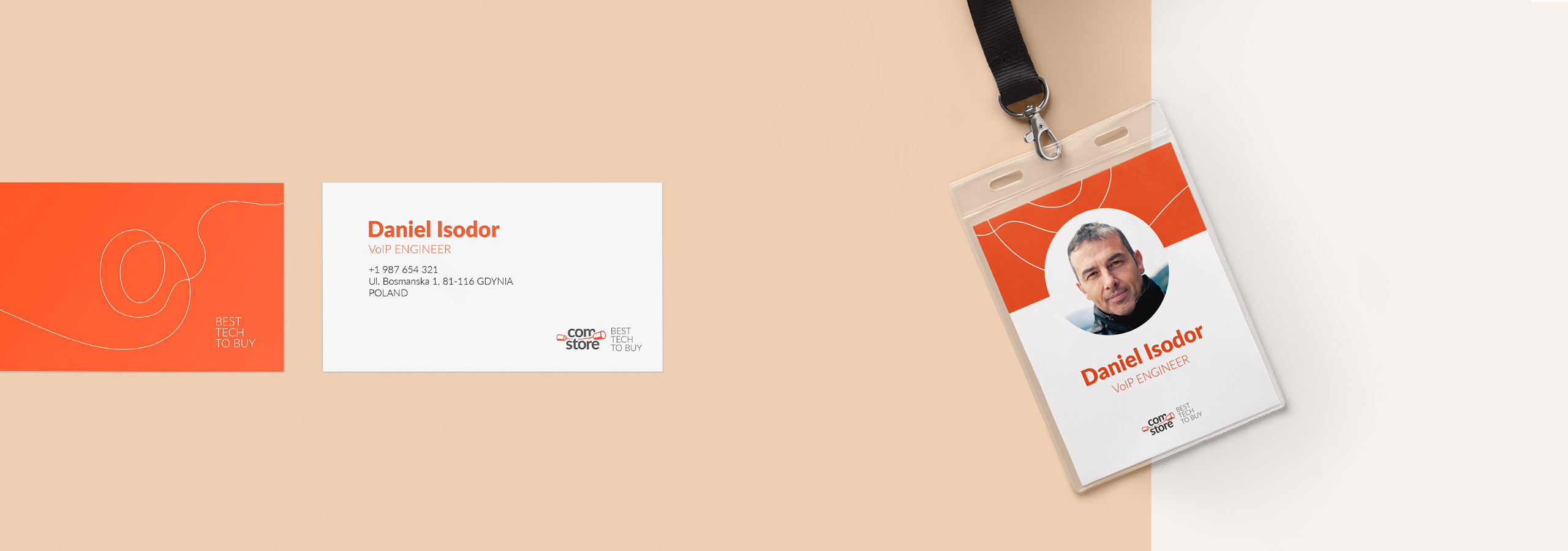
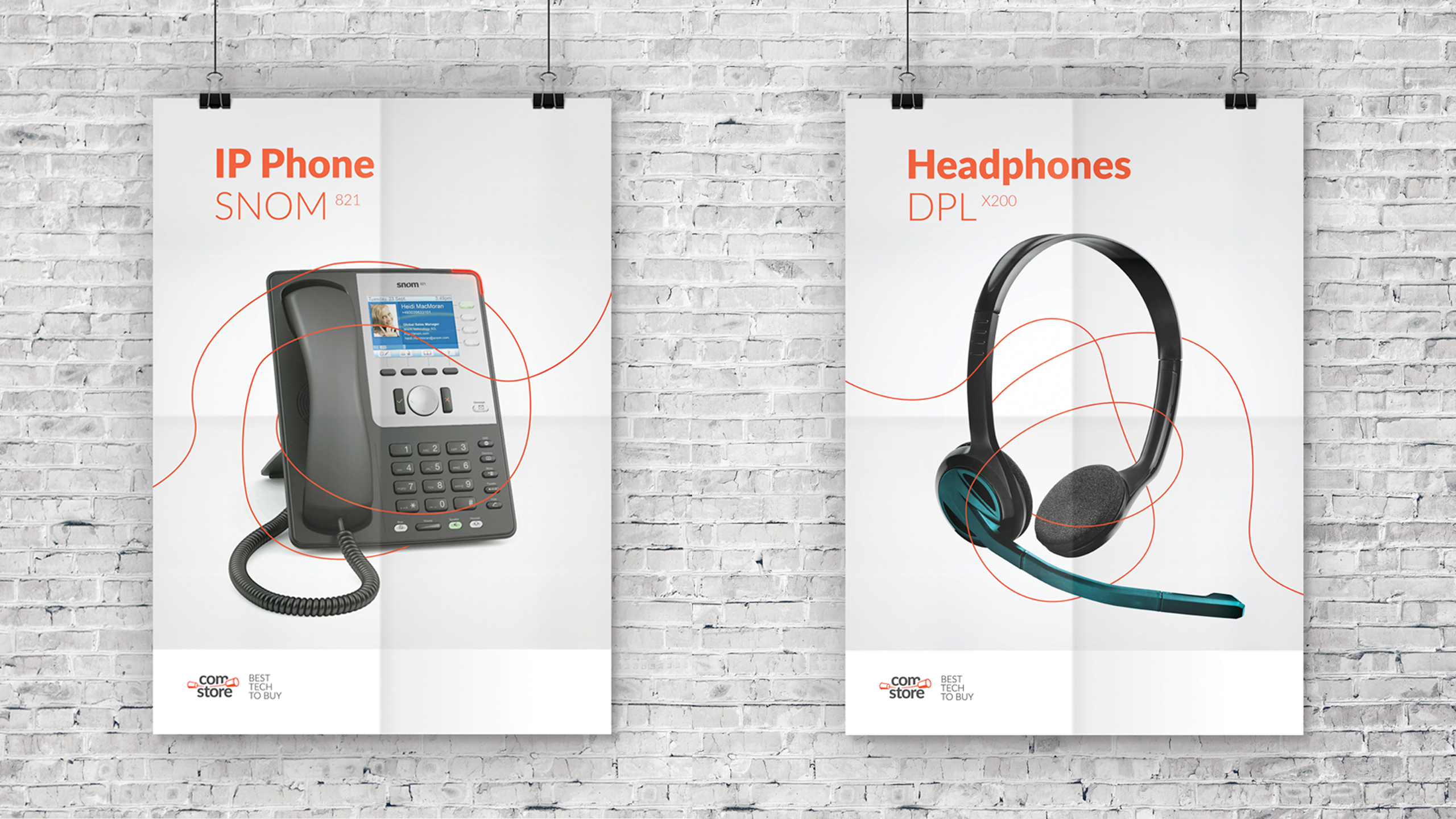
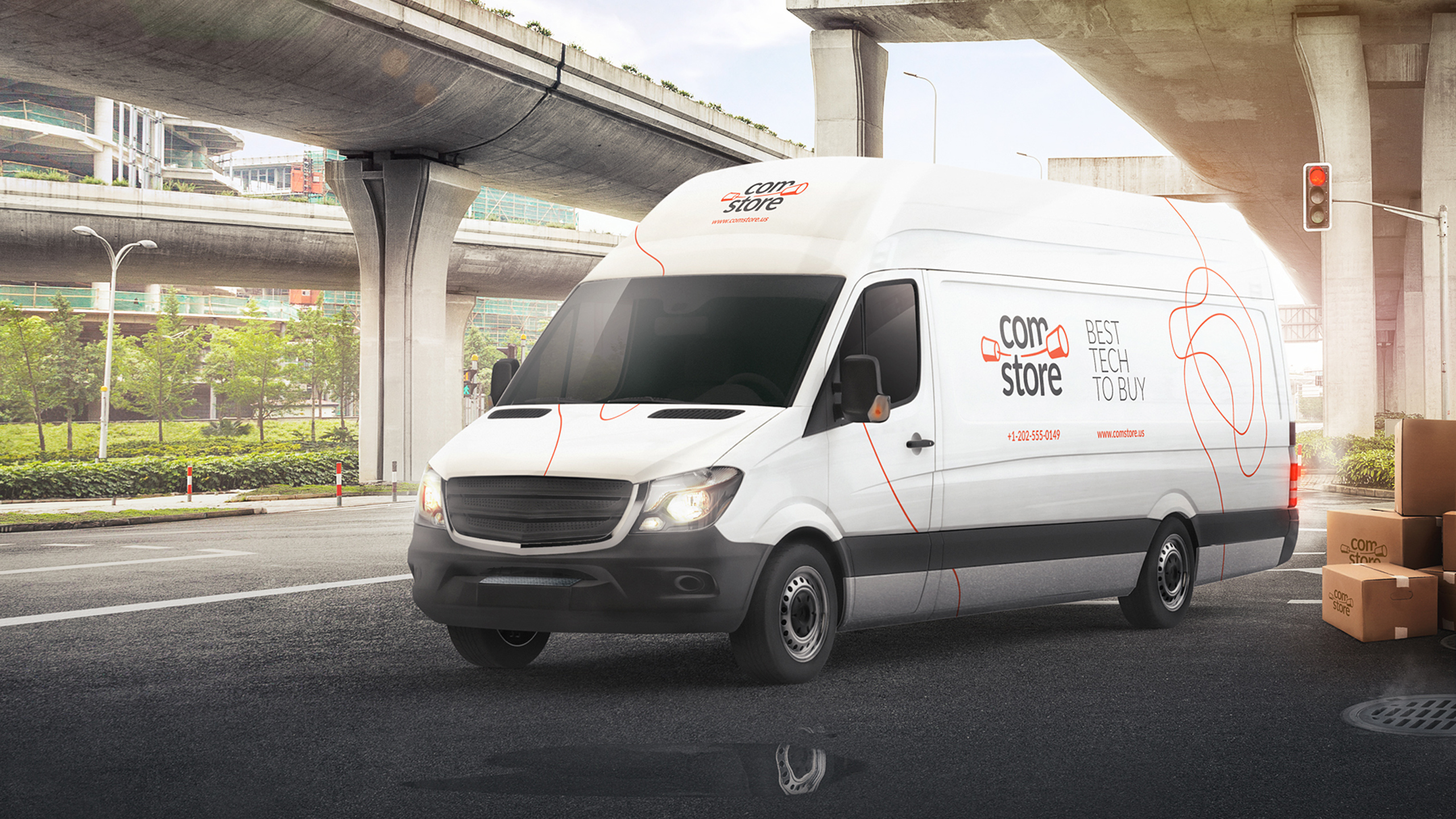
The brand identity concept was to convey the idea of the endless wire that makes communication possible even in the most twisted situations. The wire symbol is now present to emphasize the brand on every COMSTORE visual communication material, such as the poster design layout and car branding.

Packaging
Design

Develop the Concept, Design
Icons, Design Packaging

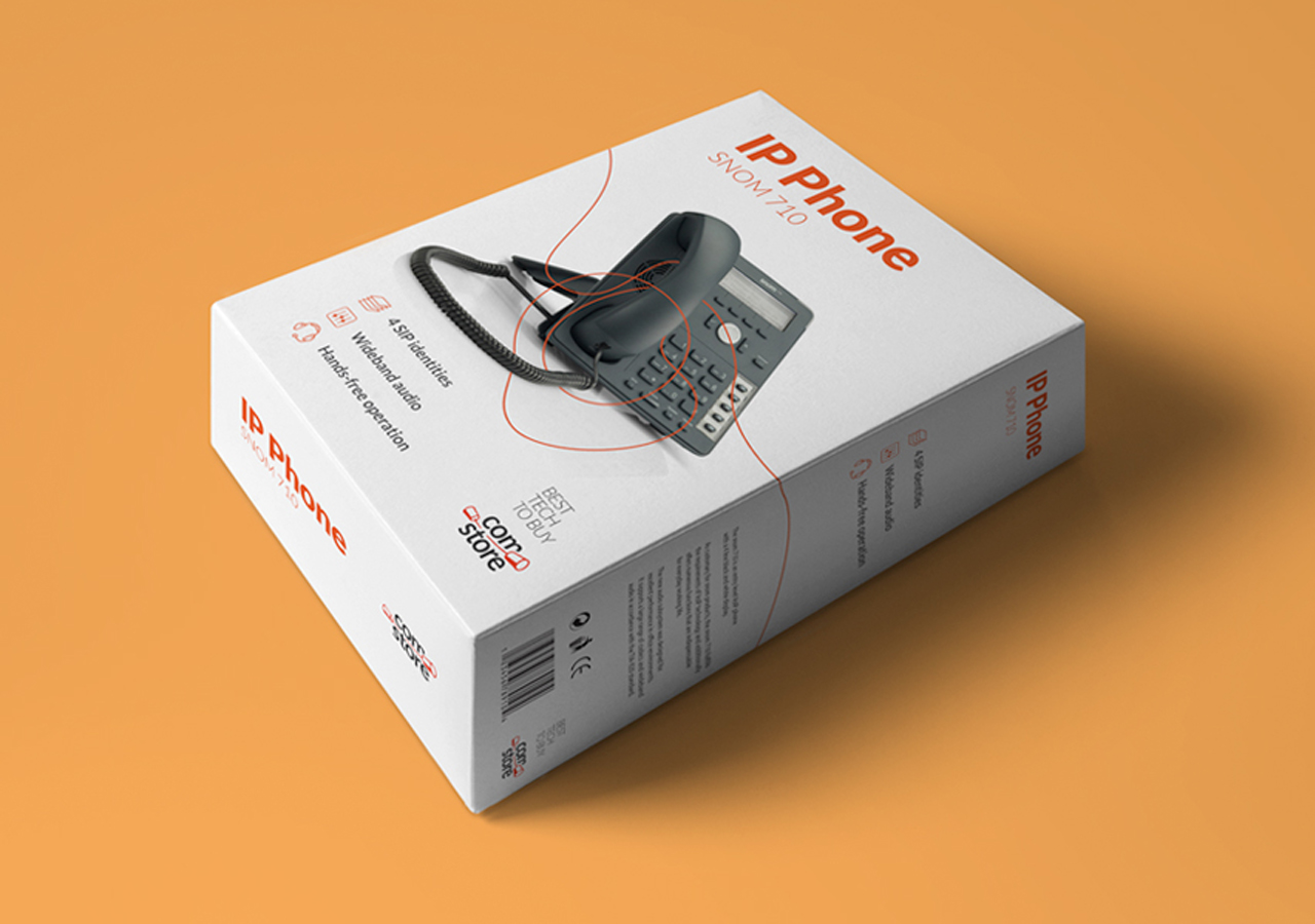
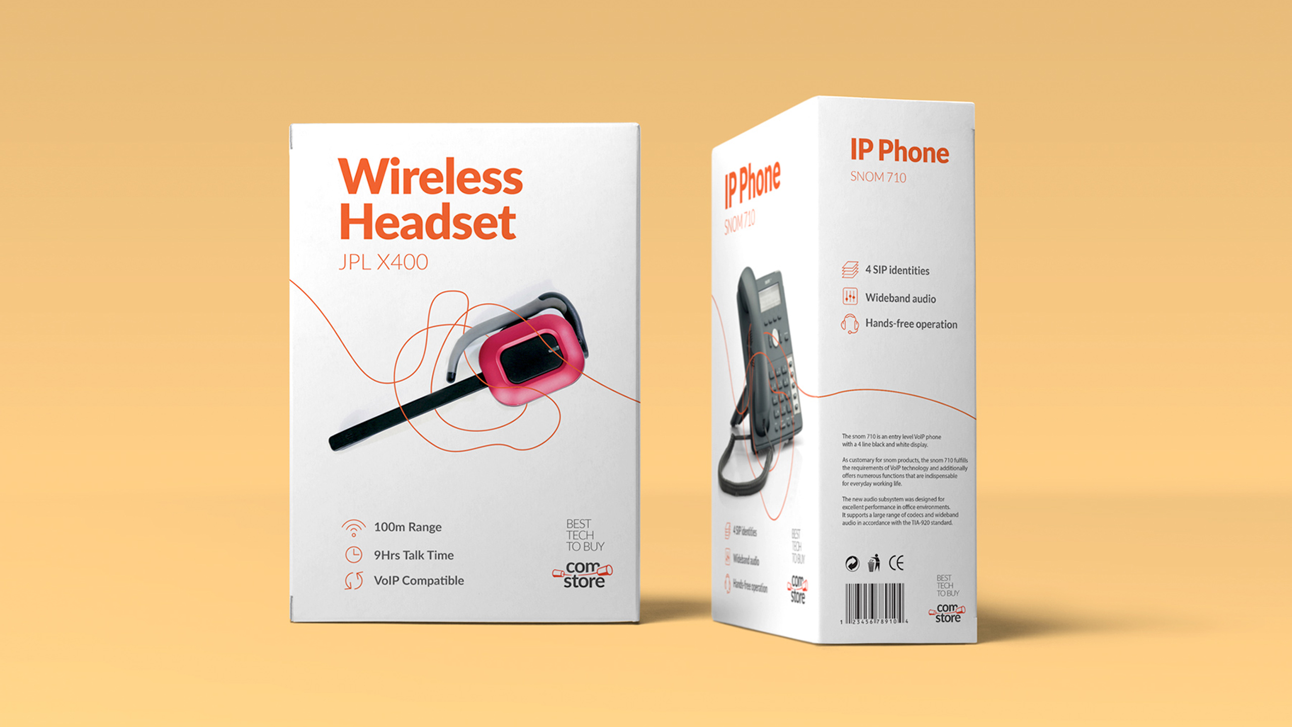
Combined with the brand identity elements, strong lettering for the titles and thin but clear technical attributes, as well as the discrete presence of the orange color, the packaging design turned out to suit the brand perfectly.

We created a custom set of icons to explain the technical features for an easy and better understanding of each product.