BRANDING & PACKAGING

Memories becoming Brand
for natural products

From Naming to Packaging
for local grocery store
From Naming to Packaging for a grocery store.

How to bring
tradition into brand
Define the Brand’s Position, Craft the
Brand Story, Develop Name, Design
Logo & Graphic Elements, Web Design.
Define the Brand’s Position, Craft the Brand Story, Develop Name, Design Logo & Graphic Elements, Web Design.

Brand Story

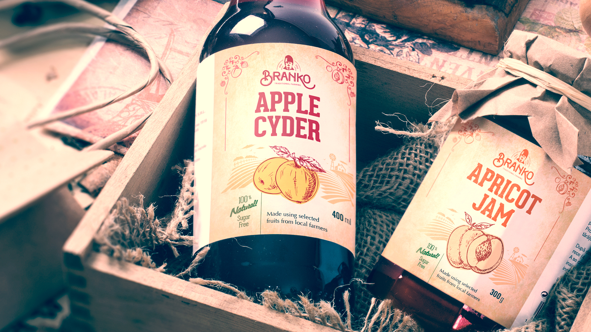
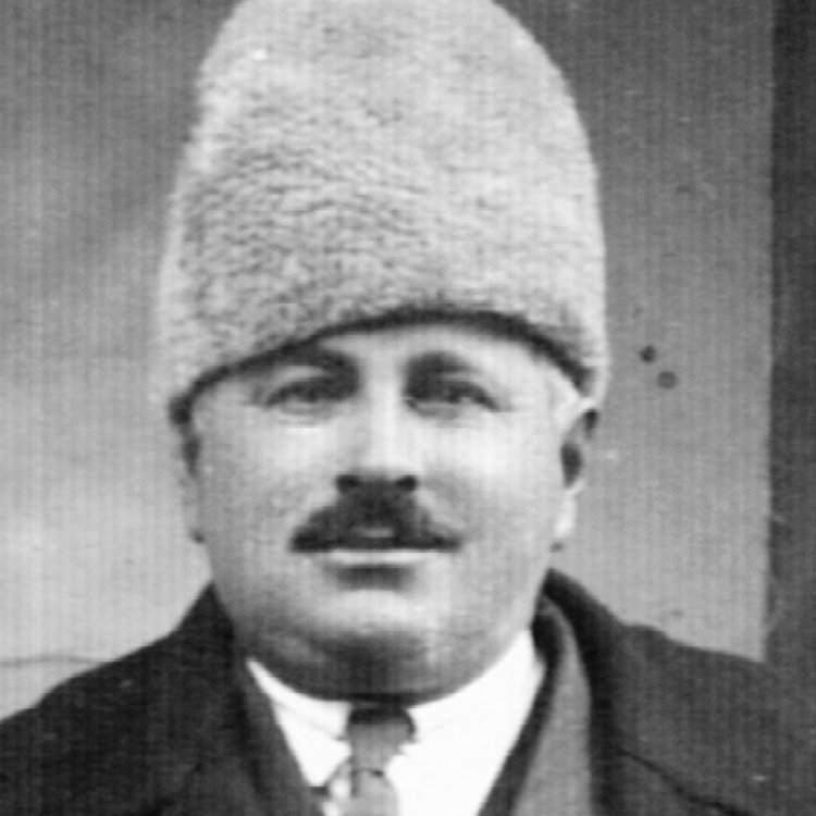
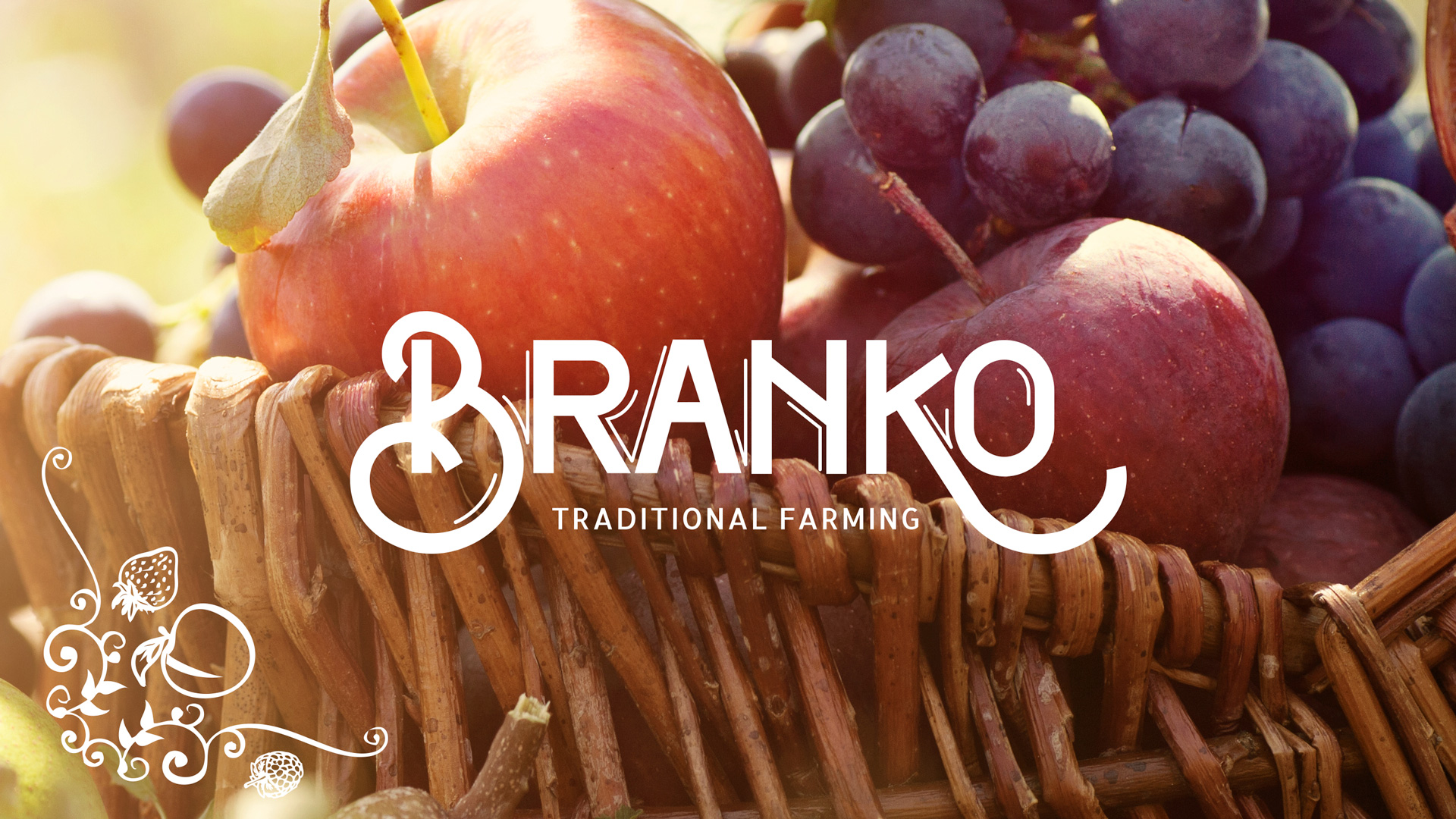
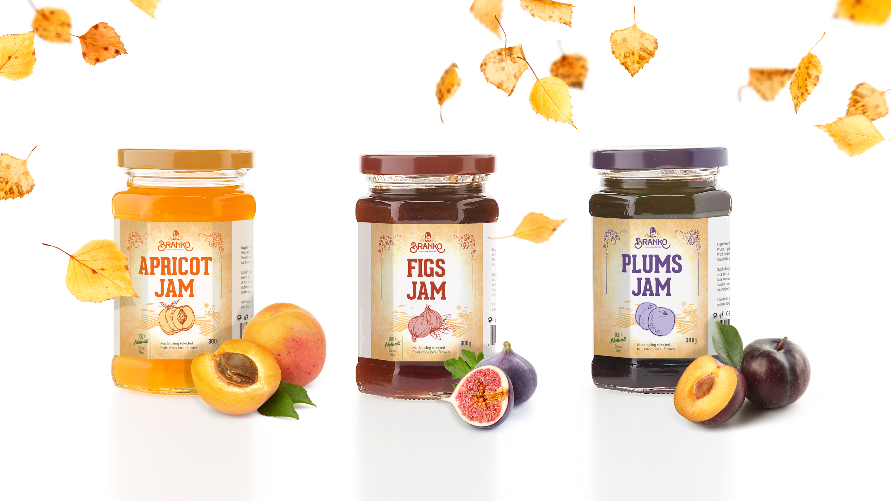
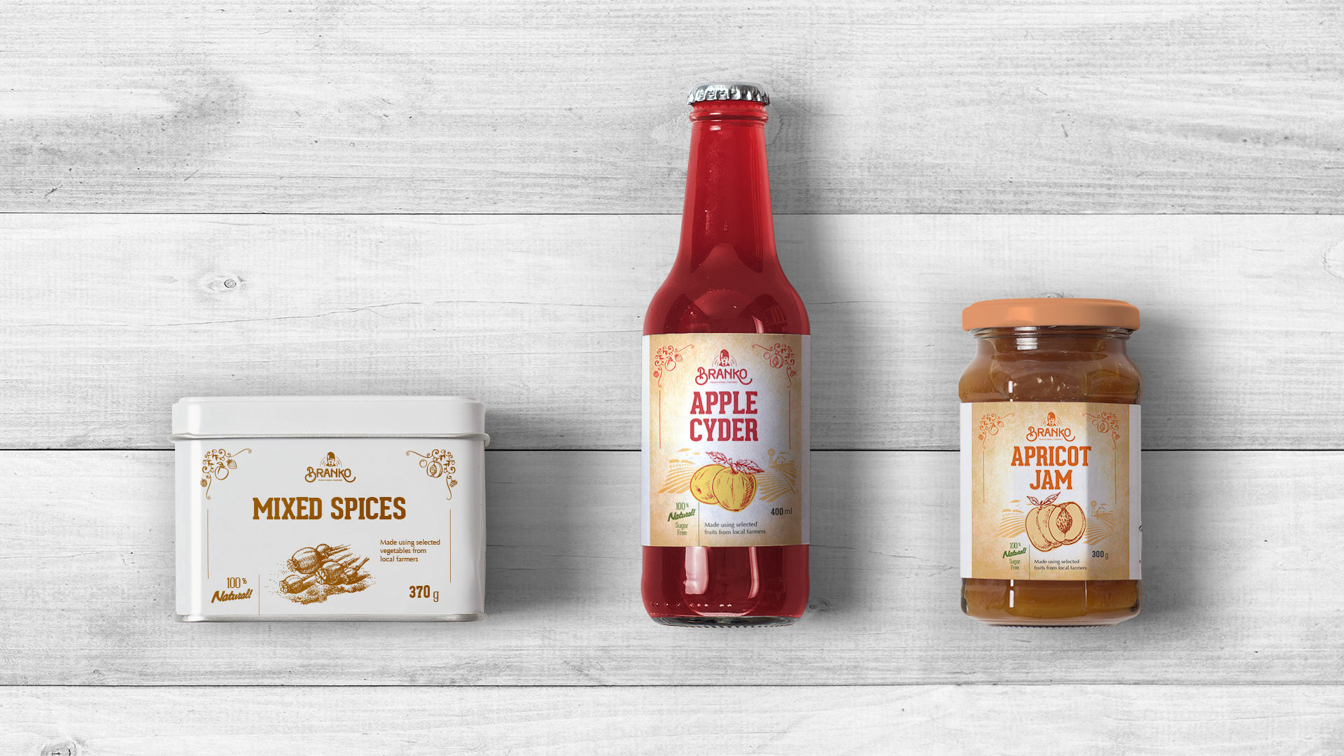
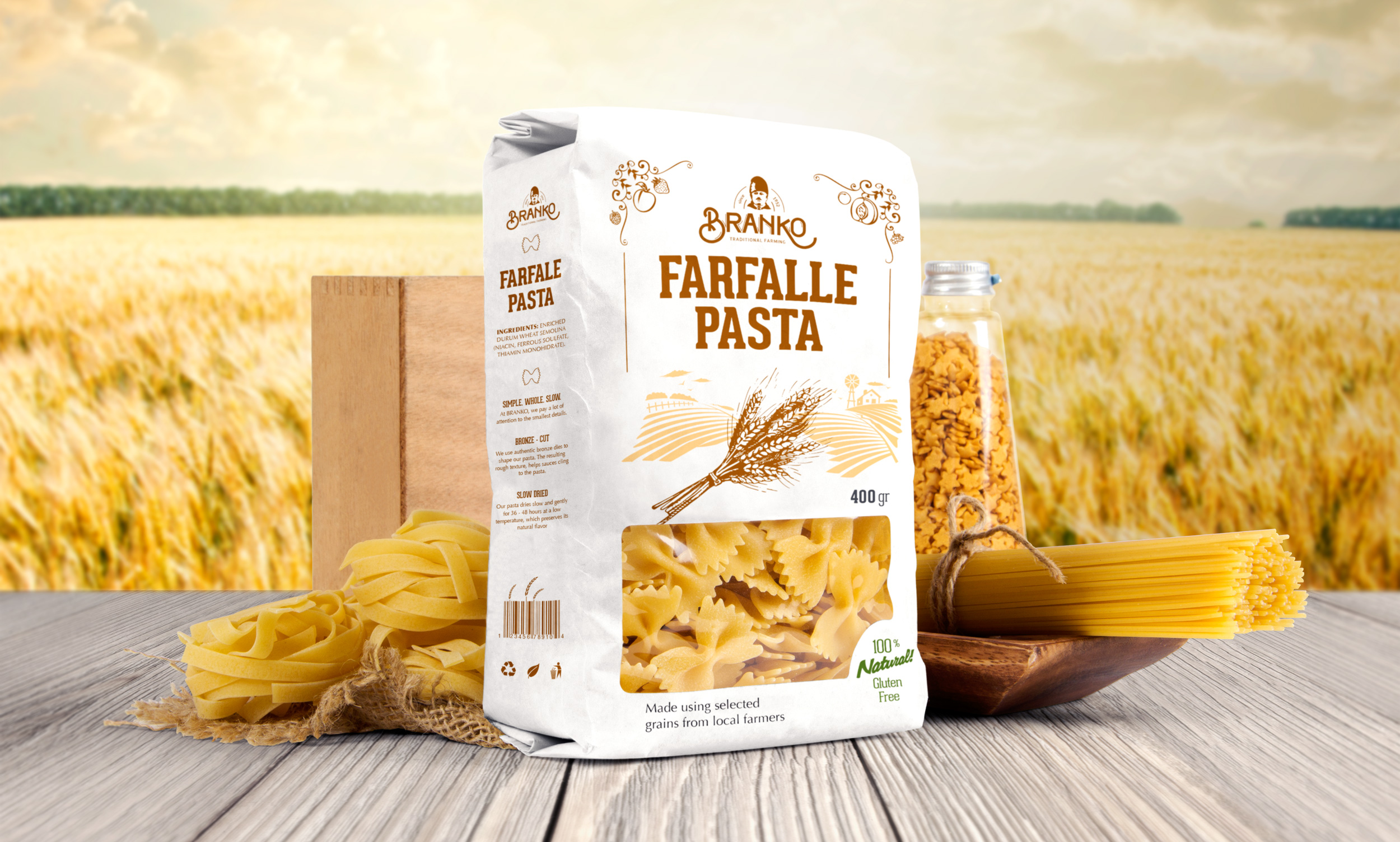
Branko was a very skilled farmer and grocer. He had a refined taste for traditional farm foods, like jams, canned vegetables, bakery products and fruits.

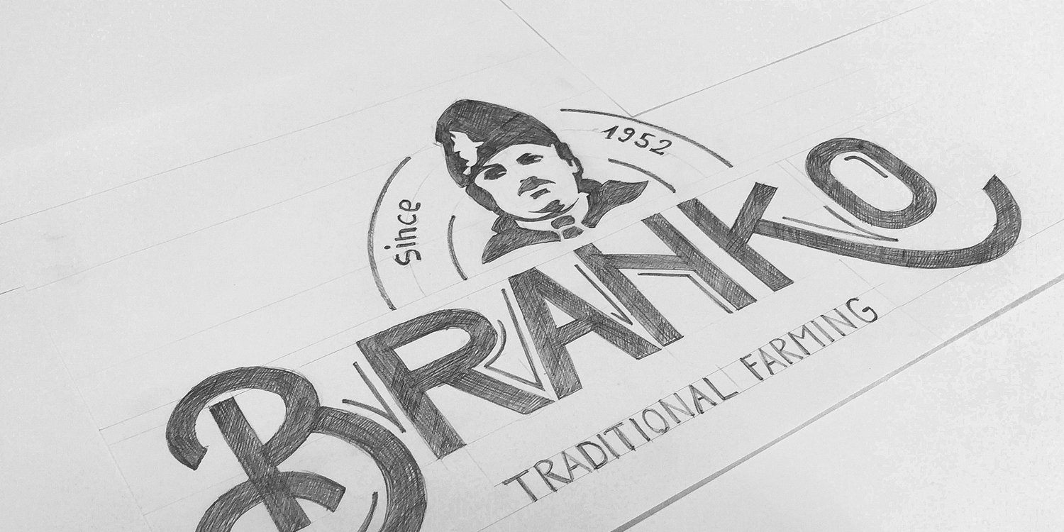
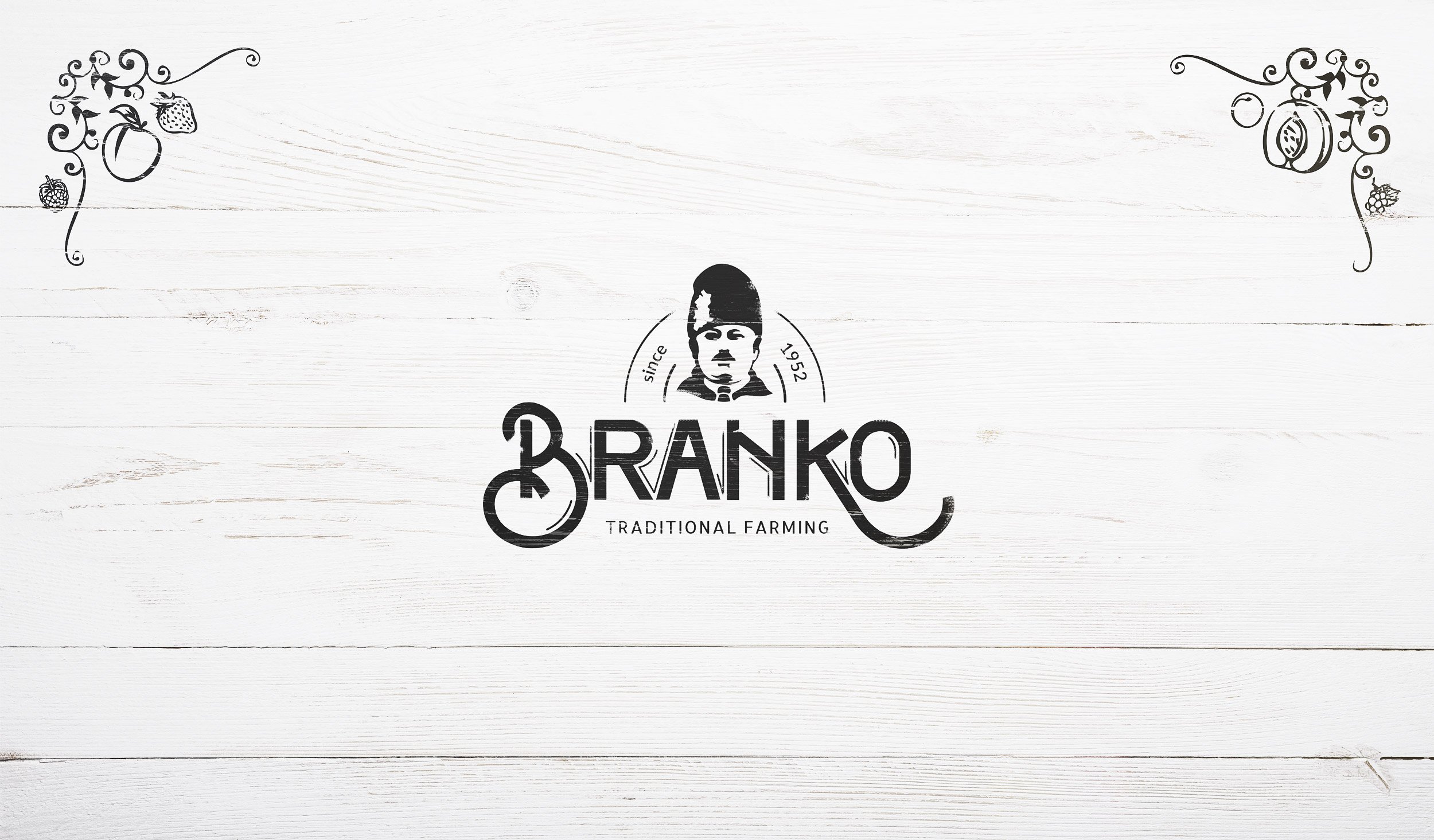
His grandson got this passion from him and carried on the tradition of the family business, which he developed on a larger scale. With this tradition and the story behind that needed to be told, they contacted us for the branding and packaging design.

Brand Strategy

The briefing session revolved around Branko’s story and how appreciated he was in the community for his hospitality and fine taste.

We came to the decision to create a brand with a rustic, vintage and unique mood that would bring trust to consumers’ minds, based on tradition and experience. The brand character will reflect, through concept and design, values such as Hospitality, Knowledge and Respect. The packaging design will then serve to express all these values using a rustic concept, but with a contemporary touch of design.

Logo Design

We went through Branko’s story and a particular picture came across as iconic. We chose this picture to craft the character logo that will be relevant for the brand. Our design team made sketches of this picture and fine-tuned the artwork until the logo character stood out. Along with the character logo, we designed custom lettering for the name in a way that would tie together the logo and the character into a brand.

Packaging

Design

All the labels we designed have a vintage layout with a discrete image of farm fields in the background. We used strong fonts from that era of the trade, so as to clearly communicate the product name and position in connection with that specific time period. The design of the custom illustrations for the label edges took inspiration from the carvings on traditional wood gates.

Every product is visually enhanced by a drawing of the main farm good, with its specific associated colors.We set up the concept in such a way that it will allow for a wide variation of upcoming products.